This is a little different than the creative code exercises we usually do here at That Thing in Swift, but here goes:
All this talk about macOS had me thinking about what we’ll see at WWDC this year and when I read Brent’s reminder about the ever-present threat of bringing UIKit to the Mac, these ideas started to click together in unexpected ways.
Brent and I have some different opinions on how UIKit could be brought to the Mac. His vision is a bit more vanilla: shoehorn menus and AppleScript and everything else into UIKit for OS X because it might bring some new developers from iOS to the Mac. Mine is a bit more of a shakeup - obviously not an unheard of move for Apple - and it also resolves the “boring” parts that Brent brings up about Mac development.
First, some backstory: UIKit is the framework that we use on iOS to develop UI concepts that feel at home on the iPhone and iPad. You can make an entirely custom UI if you want (think full screen games made in Unity) but as soon as you need to accept user input or pick a photo from the library, you need to talk to UIKit. AppKit is the predecessor to UIKit that lives on the Mac. AppKit is significantly different (menu bars! keyboard shortcuts!) and has much more flexibility because of the platform it lives on. Developers have long expected the unification of AppKit and UIKit but we haven’t heard an official Peep about it yet.
Convergence in Simplicity and Design
OS X has always danced around a simpler form of desktop applications. Dashboard/Konfabulator and Today View widgets were made with the idea that there are some apps that just don’t need a full desktop app experience to be useful. You can almost think of dashboard widgets as the original iPhone apps: no file pickers, no menus, they just do one thing really well. They’ve never been very popular on the desktop but they’ve also been hamstrung by second-class treatment: Dashboard widgets were written in javascript with mediocre OS integration and the Today View is both visually and functionally inflexible. It feels like there’s some space between shitty display-only widgets and full-on desktop apps that hasn’t been explored on the Mac.
If we consider this first approach too simple, Apple has been working this problem from the opposite side as well: making iOS apps that are more complex. Apple really pioneered the idea of non-bite-sized content creation of the iPhone and iPad with Pages, Keynote, iMovie, etc. These apps really push the boundaries of what an app is expected to do and how much real work you can get done on an iPad. Though Apple certainly doesn’t own all the best productivity apps in the iOS platform, Multitasking and Smart Keyboards prove they’re 100% behind the idea that the iPad is a productivity device.
These two approaches haven’t been given equivalent effort up until now. The iPad has made far more progress towards productivity than the Mac has made towards simplicity but if you look in the distance, you can start to see the convergence of the two approaches.
The macOS we’ll see at WWDC
Let’s paint a picture of what you’ll see at WWDC, starting with a desktop Mac with a screen that looks like multitasking on the iPad. You can do this today with El Capitan’s split view but it feels weird with apps that do custom things with the title bar (I’m looking at you Chrome) and it feels way better on a iPad than it ever does (even with the stock apps) on a Mac. Your apps are always full screen and can be split if you want more apps on the same screen. macOS will introduce more flexible window splitting that lets you create different configurations of apps and windows that are particularly well-suited to your task (Sherlocking Moom and a bunch of other useful tools). Perhaps this is managed by something that resembles the Editor > Open in... dialog in Xcode.
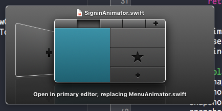
Using this dialog, you can split your view in multiple places as well as add new tabs
If you’re working on web development, you can split your screen to include Safari and a short terminal window on the left, with a large HTML editor (Atom, perhaps?) on the right. These configurations are easily saved and recalled, launching any apps needed to fill in your window configuration. Congrats, Apple just killed the concept of launching and quitting apps on the desktop, something it’s been itching to bring over from iOS for ages. If you want to see a preview of what this looks like, restart your mac with a bunch of windows open. Disabled previews of what the windows last looked like will appear before the app finishes launching. Naturally, everyone will complain that Apple stole window splitting from Emacs. Apple, as usual, put a real slick coat of paint on something that already existed and gave it a marketing name (though that name might not be Split View).
By extending the existing Split View mechanism to many splits, productive configurations can be built from many 'full screen' apps
I’ve been waiting for this next part for years: There’s no desktop showing through the cracks because there is no desktop. Your files are saved and sorted into an iCloud-like system where searching rules and navigating folders is a thing of the past. The apps that run in this new macOS are written exclusively for the new UIKit framework and can’t be run outside of it like a current OS X desktop app.
For the moment the Finder is still switchable in the background because there are no macOS apps yet (other than the stock apps launching with the beta release), but I’m not so sure about the future of a Finder-based OS X. Apple is never hesitant to divide a platform into those that update regularly and those that fall behind and this is another one of those times for developers. The last time we saw this on the Mac was the 64-bit transition (2012?) and before that, the PowerPC transition (announced 2006, removed support in 2009). iOS sees these sorts of transitions far more often with screen sizes and support for newer specialized hardware but it seems well within Apple’s interest to extend this paradigm to new macOS apps if they can.
To be very clear, macOS apps aren’t dumb like dashboard widgets, think of them as bigger, better versions of productivity apps on the iPad. They simply lose the extraneous stuff that has driven people towards post-PC devices in the last few years. Refining the experience down to the essentials has long been the core of the Apple experience and the one that serves their customers best. These new apps refine the idea of a desktop app down to the basics, giving it an iOS-y simplicity without losing productivty. AppKit developers will be encouraged to rewrite their apps for the new UIKit (which will really thrill Brent and other AppKit developers), iOS developers are encouraged to bring all their iOS apps onto macOS, and new macOS apps will only be available via the Mac App Store.
I was originally trying to make this point in under 140 characters on Twitter but it ballooned into this post. The idea isn’t to dumb down the Mac experience, it’s to bring the simplicity and familiarity of iOS apps to the Mac.
What this means for the Developer
The new macOS is announced at WWDC for a reason: developers are the only way this transition can work. New macOS apps are written using the new unified UIKit framework and Apple wants the legions of iOS developers they’ve created to start putting their content on the Mac. For all the reasons Brent mentioned above, AppKit development is perceived as harder than UIKit development and the giant box of unknowns keeps people away from developing for the Mac. Sharing lots of code between your iOS app and its macOS counterpart is going to make that significantly easier, and you’ll be able to deploy to watchOS, iOS, tvOS and macOS with a (greatly) unified framework.
For some of the most up-to-date iOS apps (notably the ones that are designed for iPad screen sizes and multitasking), your app already works on macOS. Hopefully you enabled bitcode on your latest project because the Mac isn’t going all-ARM quite yet. For most people, the name of the game to get your app on macOS is Size Classes and you’re going to want to support a bunch of them if you want to be resizable in the many different orientations that your app can be displayed in the new macOS split views. With this comes significantly better support for previewing and modifying autolayout constraints for size classes in Xcode.
Swift is obviously the language of choice when it comes to this transition, but Objective-C isn’t going away anytime soon and you can continue to create new projects in Objective-C or use it in parts of your mainly-Swift app. UIKit unification isn’t exactly news to the Swift team, they’ve been planning for it:
- swift 2’s
@availablelets us develop classes that work across iOS and macOS, resolving minor differences between the OSes with built-in OS checking - As mentioned above, size classes are a huge benefit to those working across devices. They’re minimally helpful for iPhones alone but they begin to show strength for multitasking on the iPad. They’ll really shine across shared iPhone, iPad and macOS layouts
UITraitCollectionis a UIKit class that gives more information about supported sizes and capabilities for the devices we’re running on, including force touch support, now on the Mac as well
And the best part about the developer announcements? The new macOS comes with unified Xcode for iPad and macOS. It’s Apple’s way of saying that this new macOS paradigm isn’t just for simple widget-style apps from iOS, we’re going to create something that actually helps you get work done and feels faster than your current workflow.
A History of Widgetization
Apple is rarely the first company to try out new interface concepts and a widgitized post-filesystem desktop isn’t particularly novel for operating systems. The most obvious example is probably Window’s brief foray into a widget-heavy start screen with the Windows 8 Metro UI. This approach was too far on the widget side of the spectrum, optimizing for bite-size information which doesn’t fit very well with the goals of a desktop user (and part of why the Windows Phone UI stuck with the concept).
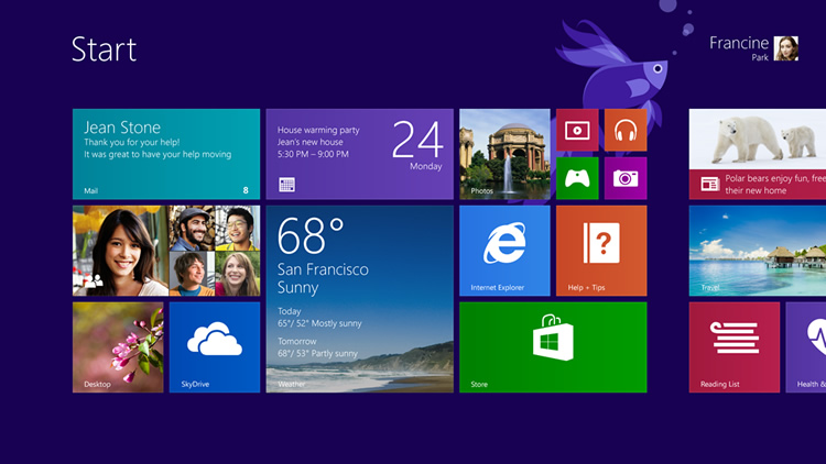
Windows 8 'Metro' start screen with widgets galore
Even Google ChromeOS can be thought of as a transition to a different kind of operating system. An icon-less desktop with a very fuzzy concept of the filesystem and essentially a single app to run. Why they still let you resize and drag windows around is beyond me, it seems almost entirely useless on the device where a decent split view manager could simplify the whole experience. The distinction here is that Chrome is the one “widget” that you get and you can fill it with anything from the web. Notably different from Windows 8, people (OK, school districts) actually seem to like ChromeOS because they’re cheap and to most people the internet is really just the web.
It’s not a stretch to predict that people won’t be happy with the new macOS at first, the least of them developers with set-in-stone workflows, which is typical of users when presented with something new. But I think the core concepts actually have the ability to be better than what we have now (we really haven’t come up with something better than the menu bar?) and it’s possible that Apple is the only company that has the experience in building a framework for radically simpler apps that maintain user productivity.
Final Thoughts
Why do I think we’ll see a version of macOS and UIKit at WWDC this year? No inside sources here but we’re overdue for a few things that could point to something new coming.
- UIKit isn’t on the Mac. Perhaps the best argument that UIKit isn’t going to be used to develop standard OS X apps is that it hasn’t happened yet, there’s some deeper thought going on about how it should be done
- iTunes isn’t getting a redesign because it’s being redesigned as the macOS Music and iTunes Store apps, similar to iOS
This is Apple so it’s always hard to say if something is being planned for tomorrow or in four years but the hype is building for WWDC this year and yet another “quality focused” release of OS X would be mighty boring.
Andrew Ambrosino has written the next best thing about macOS speculation, his ideas on convergence of the two platforms and leaving the old navigable filesystem behind are spot on. I don’t think he’s put a lot of thought into UIKit on the Mac though; the AppKit vs UIKit label isn’t what’s keeping Google Inbox and Netflix from creating native apps for the Mac, it’s the fact that you have to rethink the whole app to adhere to menu bars and keyboard shortcut conventions on a different platform. Taking an iOS-based approach to macOS apps means you have to add a few features to fit in, not rethink the whole structure. Pretty mockups though. Remove the window controls and go full screen and that’s about the same thing I expect.